A creative atelier curating brand and web designs for women-owned businesses.I design and curate intentional brand designs and websites to cultivate your idea and bring your value out there.

A creative atelier curating brand and web designs for women-owned businesses.I design and curate intentional brand designs and websites to cultivate your idea and bring your value out there.
I work with non-designer creatives, professionals and small business owners everyday, and I see their struggle when trying to keep up with the many branding terms I’m throwing at them as we go through the different phases of their brand design process. Sometimes it’s easy to forget: it’s a lot to take for non-designers! I find myself explaining branding terminology to my clients almost daily, and I get it. This is not your everyday language if you don’t work in the field.
Because of that I thought I’d put together a fun and helpful branding glossary with all the essential terms you should know when working with a designer. I’m confident to believe knowing even a small essential part of the branding terminology will really help making the design process more fun and straightforward for you (as it should be!). Ready?
Let’s go…
If branding in design is the sum of graphic elements associated to and representing your brand, the brand itself is the true essence of your business. Branding is the act of putting the brand on the market, while the brand is your why and purpose.
Also known as logomark, the brand icon is a single symbol, icon or illustration that represents your brand visually. It’s generally very visual (so no type involved unless it’s a monogram) and rich in concepts, so very communicative of your brand’s essence. Brand icons are often included in the main logo design.
The logotype is the text component of the logo design and usually represents the brand name in a choosen typography. It can stand on its own or be included in the main logo design together with a brand icon.
A combination mark is, you guessed it, the union of a brand mark and word mark, graphic and text.
Usually coming in the form of a combination mark, the main logo design is the primary image associated to a brand. The actual logo, in its most complete shape, representing the brand itself.
You’d ideally use the main logo design as first logo choice wherever possible, especially for essential functions like the logo image in your website header, documents headers or business card.
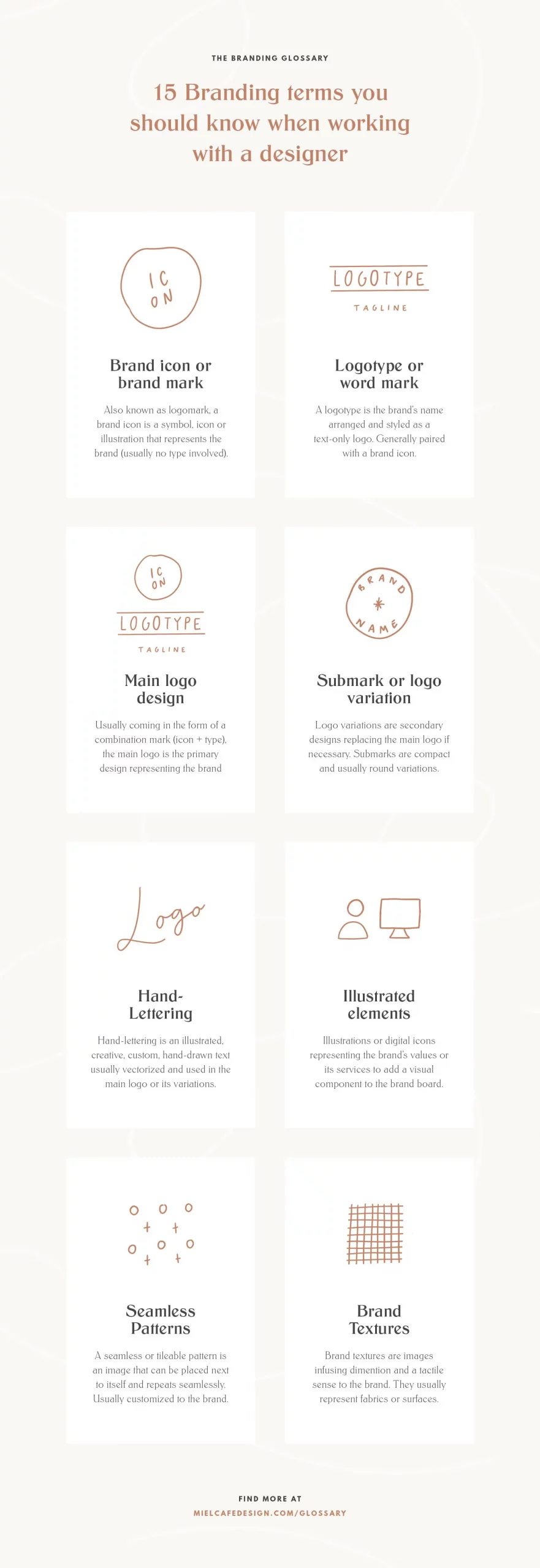
As you can imagine, logo variations are secondary logo designs. Simplified versions of the main logo, or simply different diposisitions to replace the main logo design if needed.
But something I see my clients struggling with is understanding when logo variations can come in or why a brand even needs logo variations. Well imagine a main logo design structured vertically, you can see how it won’t probably fit in a long horizontal space or in a small compact square profile icon. This is where logo variations come in! The more variations you have, the more versatile your brand is. With a good set of logo variations your brand will be ready for any possibility and never monotonous.
Submarks are very compact logo variations. Generally round or easily fitting into a perfect square, they come in very handy to represent the brand in small compact spaces both online and on print.
Hand-lettering is an illustrated, creative, (often) custom hand-drawn text usually vectorized and used in the logo design or its variations. It can come in any style (cursive, calligraphy, brush lettering, pen lettering, uppercase…) and, if custom, adds a very unique touch to any branding.
They can be digital icons or even hand-drawn illustrations, and are the visual components in a brand board, generally representing the brand’s values or services/products.
Also called tileable pattern, a seamless pattern is an image that can be placed next to itself and repeats seamlessly. They are usually customized for the brand and coordinated with its aesthetic, and can include illustrated elements but also text, lines and shapes.
Textures are instead images that infuse dimention and a tactile sense to the brand. They usually represent surfaces (think fabric, wood, cement, marble, art…), can be customized for the brand and again coordinate with its aesthetic and message.
We all know what a color palette is, right? It’s the list of colors representing the brand.
Usually it’s made of 4-5 colors (I generally suggest you stick to a maximum of 5 to maintain a certain focus) which can be further declined in darker and lighter shades, always coherently with the brand’s aesthetic.
Brand typography is the brand’s combination of fonts, meaning the fonts generally used in all the platforms and documents the brand uses.
Ideally these are the fonts a brand would prefer wherever possible, in its website for example, branded stationery and documents. However for some platforms it's not always possible to use custom fonts (think newsletters and emails), and so it's handy to define some common alternative fonts (that still coordinate with the brand's message) to use in these cases.
A brand board is a proper board made of all the graphic elements created for the brand. It usually includes: logo design, color palette, brand typography, logo variations, submark, illustrated elements, textures and patterns.
These are all the designs and templates for any coordinated material thought to promote the brand online and offline. They can be either stationery and printed materials like business cards, flyers, brochures, product packaging, or digital materials like social media branding, newsletter branding or even document branding.
Here you go! 15 essential branding terms I’m sure you’ll encounter in your branding journey and when working with a designer. Yep, there are many more, but really you shouldn’t bother learning them all – I assure you most designers are REAL people and don’t always use fancy terms! 😉
Now you’re ready to hop on your branding journey and get excited about the design process. Have fun and feel free to bookmark this page or download the infographic to always have the most essential branding terms handy!

I'm Giada Correale, brand and web designer of Miel Cafè Design graphic studio. I design intentional and editorial brand identities and web designs for heartfelt women-owned businesses.

I'm Giada Correale, brand and web designer of Miel Cafè Design graphic studio. I design intentional and editorial brand identities and web designs for heartfelt women-owned businesses.
A creative atelier curating brand and web designs for women-owned businesses.
I design and curate intentional brand designs and websites to cultivate your idea and bring your value out there.
[…] Together with logo variations, I provide my clients with extra graphic elements coordinated to the brand, such as patterns, textures or illustrations. […]